There is a very important concept in design, called empathy, which is actually thinking about problems from the perspective of users.
This Monday, Japanese graphic design master Shiraki Akira came to the company to give a lecture. He mentioned: Design thinking is to deny routine. Regarding conventions, what I understand is: it represents our own independent cognition and common sense shared with the surrounding environment, and to deny conventions is to jump beyond the limitations of common sense and self-cognition and empathize with ” Users” know how to empathize.
Design, de, and sign form the word. Everyone knows what sign means, just like a signature, just like the national flag is the sign of this country. Everyone knows something in common, and one thing that everyone can understand, such as Everyone knows the Chinese flag. If they don’t know it, it’s not. This is everyone’s common understanding.
He is one of the most common and common sense. What does de mean? This is the meaning of “negative convention”. Everyone thinks that things are routine, and we should always have a negative attitude to think about whether this is a routine or not. Specifically, you have to use the simplest way to change your perspective.
For example, my height is 164, my eyes are around 157, so everything I see is at 157, so my life is at 157, so everything I see is like this, such as changing a person , I have a 4-year-old grandson. Think about what he sees must be different from mine. This table, I can see the things on it very clearly. My grandson can’t see it. When you change When it comes to perspective, the world is different. Design is to change the perspective you are used to seeing the world. -Shiraki Akira
When our designers make design plans, there are many methodologies to help us develop plans more efficiently, such as: user experience maps, service travel, character portraits, shadow exercises, storyboards, scene restoration, user research, AT-One Principles, task analysis methods, usability testing, etc., the core is “everything is user-centric.” However, even if you use these methodologies and tools thoroughly, but the things you design do not necessarily enhance the user experience, you will find that tools are tools after all. To truly empathize with users, rely solely on tools and methods. In fact, it is far from enough, and more importantly, I think it is “experience”.
The experience mentioned here does not refer to the work experience of a designer, but the accumulation of years of “reading thousands of books, traveling thousands of miles, and reading countless people”. The accumulation of age alone is not enough. Without rich experience, a designer cannot make a good design.
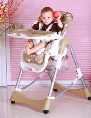
Child seat
In traditional strollers, the position of the child is always below the range where the parents can communicate comfortably. Parents have to bend over frequently, and the child also loses many opportunities for communication. So through empathy, we found that increasing the height of the child seat can give children and parents a better communication experience. And this kind of innovation comes from the designer’s emotional experience in the communication between parents and children, rather than purely through observation.

Wheelchair seat
For patients who use wheelchairs, because they can only communicate with relatives or medical staff who can only turn their backs to the stroller, they can only communicate each other’s emotions through sound. And if you install a rear-view mirror on the cart, so patients can communicate with their relatives or assistants.

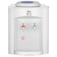
Drinking fountain in the office
The height of the outlet from the base of the drinking fountains on the market is designed very interestingly. The glass cup for household use is too high and often splashes when pouring water. In an office environment, most people use a vacuum flask, and the height of the vacuum flask is much higher than that of the water outlet. Therefore, employees need to place the vacuum flask diagonally every time they pour water, and the water cannot be completely filled. Fill it up, or it will overflow. If the faucet can be designed to be adjustable in height, and the water outlet position can be adjusted according to the height of the cup when receiving water, it is not only convenient, but also can avoid water splashing.

Right and rounded design
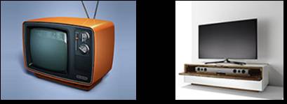
In life, we will find a lot of things designed at right angles, such as: door frames, cabinets, windows. There are also many things with rounded corners, such as phone handles, sofas, and bathtubs. Moreover, comparing the new and old TV series, you will find that most of the previous TV series are rounded corners, while the current flat-panel TV series are mostly right-angled designs. Why?

Old TVs do not have remote control devices, which require people to change channels and volume by hand, while modern TVs can be controlled by remote control. Therefore, more hand-operated items often use rounded corners.
Most of the phone handles, door handles, and modern mobile phone designs have a certain curve design, because to interact with it, it must be in direct physical contact. If you use a right-angled design, it will make them appear sharp, making people feel blunt, cold and not easy to approach, and the rounded corner design makes the interaction behavior of contact more smooth and comfortable. So the design language that rounded corners convey to us is: touch me with confidence! I am safe.
What does the right angle express? There is no need for frequent physical contact with the object, so the object does not need to signal the user that it is safe to touch me, so there is no need to use rounded corners. The right angle conveys to the user, “safe, stable, and tight fit”.
Tips for men’s toilets
In order to prevent people from getting everywhere when going to the toilet, someone once came up with a good reminder-“If you do not urinate in the pool, it means you are short, and if you urinate outside the pool, you are soft.” The most effective way is to let the other party know that the harm of this matter is beyond his tolerance, or let the other party fear the consequences of this event from the heart. There is also a plan here that is, if you pee outside the pool, you will be fined 100 yuan, but such a plan is not supervised, and most people will not believe it but it is invalid.

Many of these little details are like a casual greeting from others in life, “Have you eaten?”. It seems casual, but it makes you feel so comfortable and just right. And the more excellent designers are, the more they can find these details that are easily overlooked. They know how to observe their words and know what users need. Like many straight men, when they hear long talks from female compatriots, they are busy telling each other how to solve the problem:
“The leader scolded you? You should analyze this question objectively, balabala…”
“I bought something but was slaughtered? I have said you many times, balabala…”
In fact, the high EQ approach is to silently accompany the female partner, listen to or vent with her. The reason for a woman’s complaint is not to ask you to help him solve the problem, but just to find an outlet for venting. After venting, it will naturally be in a good mood. To do a good job in product design, this sensitive and high emotional intelligence is the core key factor, that is, not to solve the problem, but to find the “real problem.”

