In this era, the rapid development of machine intelligence is changing the products we design. Similarly, the method of designing them also needs to be improved. This article aims to start a topic: design in cooperation with machines, as well as the working methods and design language of product designers in technical fields such as artificial intelligence and machine learning-I call this “invisible design”. I believe these methods and tools will plant the seeds for the future of product design.
The machine has always been my constant partner. I need to use a machine to turn the ideas in my head into real ideas, so that I can share them with the outside world. When I was in my twenties, my career changed from being a modern dancer to a designer. Before that, I never thought that a machine would be my inspirational companion.
Invisible design: design in cooperation with the machine
Invisible design-the working methods and design language of product designers in technical fields such as artificial intelligence and machine learning.
As long as we spend time observing and analyzing, we can gradually see the invisible forces behind things such as mathematics and science.
To give an example, in the 18th century, an English gentleman strolled in his garden and observed an apple falling from a tree. He began to wonder why the apple didn’t fall diagonally or fall upward. how did you do that? What force is it? What are they made of? Does this power have the same effect on as small as an apple and as large as a carriage? Sir Isaac Newton fought against this issue for more than two decades, and finally obtained the law of universal gravitation, successfully describing an invisible force that has a definite impact in our daily lives.
The impact of invisible forces in our lives can be unexpected. Once, I browsed my Facebook carefully and found that some of my friends like “Simply Framed”, which is a company that allows you to create and buy traditional posters or painting frames online.
So, I began to think about the unframed works in the storage room, and learned about their services. What makes me want to try those recommendations? What attracted my attention? What information is needed to personalize that push? The invisible force of science and mathematics here is not gravity, but Facebook’s algorithm. Advertising software is only the origin of the power of machine learning, and machine learning is also the direction for this type of product in the next five to ten years.
In the future, machines will continue to make more decisions related to user experience, and design cooperation with them is a crucial partnership for product design in the future.
Just like any craft, the process of creation is composed of these independent parts-understanding, tools and interpretation. During the launch of Airbnb’s series of data-related products, I began to have the idea of developing invisible design. I want to share some thoughts that I have observed in my own work.
The premise of product design is to understand
Only when you truly understand something can you design it.
Imagine you are designing an airplane without knowing aerodynamics at all, or designing a glove without knowing the anatomy of the hand and the environment in which it will be used. To design a product well, you must understand what can be done.
Last year, our product cooperation group was undertaking such a project to build a new machine learning pricing tool for our homeowners. We are trying to create a model that can answer this question-what would a list of predetermined prices for any day in the future look like?
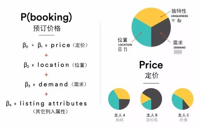
Answering this question is not easy. My data science partner created a regression model and I tried to keep up with their description. The words they use are all alpha and beta, and I can keep up with them when he shows me the illustrations, but the language they speak is like an alien to me, a person with a design background. Afterwards, I sat next to him and asked him to draw a diagram of this model to explain it to me. This process was an experience that opened up the horizon. When he started to use the language I understood-sketches and diagrams-to tell, I immediately understood the model and its mission. At this moment, the light bulb in my head lights up, and I understand what the machine can do for this product, and how to interpret this information and apply it to the experience. We are all excited about this understanding. Once the language barrier is broken, we can fluently communicate on the future direction of the product, which can truly elevate product thinking to a higher level.

The smart pricing regression model, with its schematic diagram next to it, explains that this model is composed of three parts, which are different for each homeowner.
I realize that this kind of dialogue should not be just an example, but can have a greater impact on our team. The discussion we have just now is just a very small storytelling, like a designer quickly drawing a sketch of the interface on a notebook.
From my colleagues, I realized that the story of a product is not only the part that users can touch and see on the screen, but it also needs to be able to describe what happens behind the screen. Often in the initial stage of creating a product, a complete story about how the experience affects the end user is created. It helps everyone understand what the product looks and feels like. This process can take many forms, from storyboards to prototypes, strategy diagrams and diagrams. There are many reasons why people create these forms of display. A very important reason is to establish a common understanding of product vision.
Understanding each other injects energy into the team
Understanding each other injects energy into the team. Establishing a shared knowledge system can make creativity no longer just a few subtle changes, but can urge the entire team to take a big step forward. In the exploratory phase, visualizing the role of data and machines is the first step in invisible design.
I continue to work with my team to create data visualizations that tell stories while creating interfaces that our users can directly interact with. We have created a variety of products, these visualizations have also changed in many ways, but in the end they always help to inspire, inspire and educate the increasingly open product team.
After understanding what we design and how it works, we can start building this product with a variety of tools. Carpenters have hammers, photographers have cameras, product designers have design drafts, and software engineers have code.
Interestingly, in the many examples above, only one tool has the ability to learn, change, and grow over time. Most product designers now use responsive tools to polish the interface-shapes and pixels are directly input by the designer and presented on the screen. We will also use these tools to design finished products, which can be directly controlled by programs in the system, such as responsive platforms and components. Our product partners in charge of data have also adapted to tools that have evolved over time. Physical systems, economic models, and algorithms have all become variables that grow organically, shaping the final product. Technology based on these factors can learn and determine its own development track.
Combining the tools used by designers, data scientists, and engineers is beneficial to each other in the entire product process. Design is not just to build the final user interface. This is the next step in product design.
The invisible design adds data sets and algorithmic decisions to the initial steps of the design-wireframe and usage process-bringing dimensions into a consistently flat and static process.
For example, in the first iteration of our smart pricing tool, there was a holiday pricing reminder activity. From the past holiday season, we have learned that travel demand usually has a trough in the last few weeks of December, and there will be a surge around the New Year, because there will be a lot of trips during this time. We hope to let our community of homeowners know that if the list price is lowered in December, they can attract more travelers.
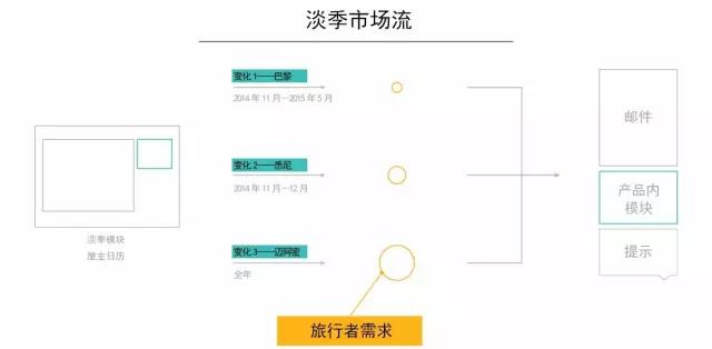
In our wireframe stage, we have a uniform size module to communicate this kind of information, and this module will be used in all situations. From the data model, we understand that there are many different off-seasons in the market, which require different messages and visual forms. For example, Sydney’s off-season starts in December, while Miami has no off-season due to the continued demand of holiday travelers. Our use process and wireframes can show market trends and data will have an impact on the product.

The market flow example shows the different changes of the module, and the required information is generated by the fluctuations in market demand.
At Airbnb, we design for users around the world who have varied needs and are located on different device platforms. We have been looking for opportunities in processes and products to build systematic models that can simplify and extract knowledge from complexity. These use cases derived from market demand, after visualization, present a system with internal communication, rather than some independent modules. Although we quickly adjusted the visual design before releasing the new features, the review showed that in some regional markets, we missed some opportunities because we did not get the off-season information before December as originally planned.
Everyone can have the ability to understand one thing and learn how to use a tool, but the true craftsmanship is developed over time by accumulating experience and personal style. I am honored to be able to work alongside extremely talented designers in this field. To put it humbly, many of the designers at Airbnb I work with are like this. However, creative insights are not limited to designers. The insights brought by data scientists are also an art form of its own. Creating models and interpreting data sets as speculations about human behavior revealed to me an important thing: human behavior is complex, and product experiences cannot be designed by a team alone.
For many years, the various majors of the organization I work for have been separated-designers work in one department, and software engineers in another. It was the same when I first joined Airbnb. We are just 10 designers in a company with more than 100 engineers, and there is not enough space for events. As we grew, the vice president of my product formed a leadership team consisting of a design leader (myself), a product leader, a data scientist leader, an engineer leader, and a financial leader. My worldview began to change. I experienced some conversations I had never experienced before, and learned about their respective fields of expertise. We will make decisions together. I learned how other worlds work and how to use the expertise and abilities of my companions to better build products.
The composition of the product leadership team
The product leadership team should be composed of experts from different disciplines, who make key decisions as an independent team. This structure is very important for the implementation process of invisible design, but it is not a common pattern for Silicon Valley technology companies. Some companies are engineer-driven, in some companies the product manager is the boss, and there are designers in other companies who have the final say. But it is very rare that major professionals work together to form a true cooperative relationship, make decisions together, and respect them when they fall into other professional fields. Sometimes some healthy skirmishes can help shape an explosive product.
Let me give you an example in the smart pricing system to illustrate how such a team structure promotes products. This model predicts the price that homeowners should have any day in the future. After our homeowner turns on the price reminder, this product can automatically adjust the daily price for the homeowner. We think this is very conducive to the task management of our homeowners, so that they do not have to adjust their prices on a daily basis. However, in our user survey, we heard that some homeowners want to set a maximum price, regardless of market demand. This surprised us because these homeowners can actually make more money. In this unique example, the homeowners have their own personal definitions of the prices they want to offer to travelers.
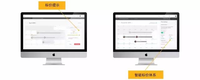
This model works as expected, but the product still needs to consider the quality feedback collected from the homeowner. The cross-professional leaders in the group discussed these findings and necessary updates to the experience. Bringing researchers, designers, product managers, engineers, and data scientists together, this team can quickly locate product strategies and experiences, balance user and data needs, and create a highly successful product. More controls are integrated for the homeowner to use, including the ability to set maximum and minimum values, and set the frequency with which visitors are expected to be entertained. From the picture below, you can see the gradual development of the smart price system from the first version of this product, the price indication, to the current smart price system.

The suggested price is actually a description of the possibility of being booked, and the price reminder is a simple interpretation of this model. In the initial version, if a homeowner opens the price alert for a month, there is no flexibility to set the alert limit and can only skip specific dates. Our latest version, the smart pricing system, allows up to 4 months of reminders, and has more granular adjustment tools for the global minimum and maximum prices, to adapt to the adjustments and functions that the homeowner finds valuable. The smart pricing system is loved by many homeowners. This is the result of cross-professional team members who can communicate well at important junctures.
These ideas are just the beginning of the topic of invisible design. I will dig deeper into my product design path, and I will continue to explore and write down the knowledge, tools and interpretation findings obtained in this process. If you want to understand how invisible design develops in practice, you can watch a more in-depth smart pricing system use case in “Design Science”, which I did earlier this year at the Helsinki International Interaction Design Association. An interview.

